Not My Circus – Limited Edition
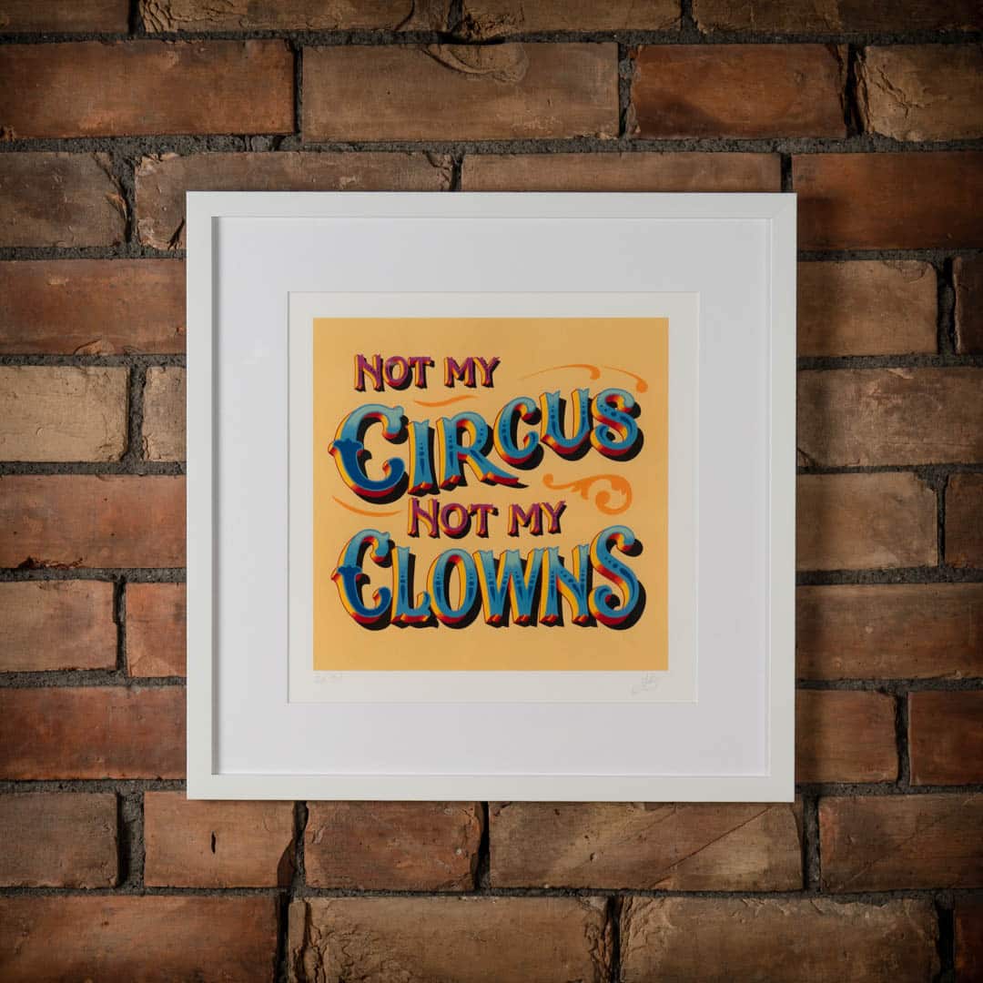
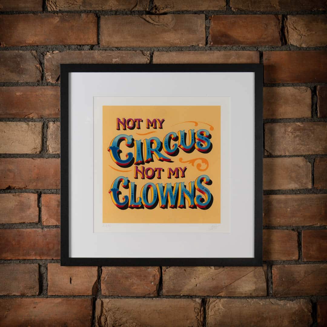
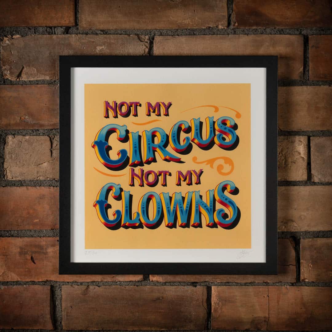
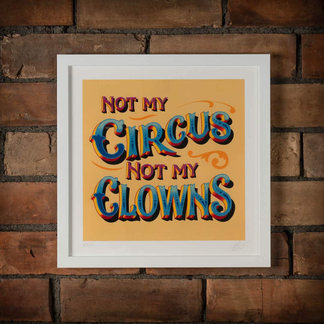
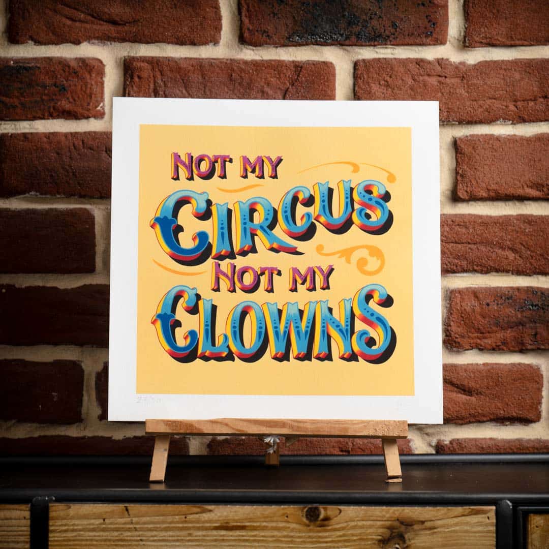
‘Not my Circus’ is a limited edition fine art print which features hand painted lettering created by Joby Carter in his UK workshop using traditional signwriting techniques. There are no computers or modern shortcuts used by Joby, everything is drawn, painted and embellished by hand in several stages across a week.
Once complete, Joby’s artwork was then professionally scanned and giclee printed on museum grade fine art paper (310 GSM) using lightfast inks, ready for you to display on your walls at home.
The overall paper size is 12×12 inch and will fit in standard 12×12 inch mounts or frames. There are just 50 of these ‘Not my circus’ prints available. Each one has been numbered and signed by Joby on the front of the image. The print is sent flat in a protective cardboard sleeve.
Please note: These prints are a bright and vibrant reproduction of the original sign. This print is a limited release print that has been created from a scan of a hand painted original and it has not been digitally airbrushed, and you may see minor imperfections from the paint brush or varnish which are part of the authentic charm of hand painted lettering..
Price range: £100.00 through £120.00
Joby Carter says:
I’ve really enjoyed painting this sign and in many ways it was an experiment of techniques. I marked the lettering out by eye without a ruler for measurements, then I roughly marked it out with a chinagraph and painted it in letting the brush do the work which the way I love to paint.
I teach (and preach!) people how to layout their block lettering using a specific technique: the 45 degree triangle trick, which is a technique that people find easier to understand when they are learning to signwrite. Not all signwriters use this technique and I know that this wasn’t always used by signwriters back in the day.
In this design, the block wasn’t marked out using my method of the triangle trick. Instead, it was done by eye and painted on roughly where it should be, but there are quite a lot of quirks in it, where it’s not all going at 45 degrees. I let the brush decide where it wanted to go with an understanding of where it should be. This was common with fairground artwork, canal signwriting and signwriting in general. You could say that doing it this way takes away the ‘uptight’ nature of perfect lettering. The eye doesn’t always want it to look too perfect (but you’ve got to understand what you’re doing to do that).
Much the same with the shadow on the lettering. I have a specific way of marking out shadow so it goes where it belongs, but I did this by eye knowing where it should be. If you check it against the method I teach my students, you might think it’s in the wrong place, but it works, it’s got flow, it’s got movement its got rhythm.
The sentiment of ‘not my circus not my clowns’ is great, I think the original was Polish and was not my circus not my monkeys, I just thought I’d put a different spin on it.
Shipping
All orders not containing paint have a standard postage fee of £4.95 within the UK. Orders are usually processed within 48 hours and will be delivered to you within 5 working days via Royal Mail Tracked48 Parcels postage service. For international shipping options view our delivery & returns information.
All orders containing paint have different rates of postage and are not able to be shipped internationally. Orders are usually processed within 48 hours and will be delivered to you within 5 working days via APC. For paint shipping options view our paint delivery & returns information.
You may also like…
- Discover the wonderful world of ... read morePrice range: £30.00 through £40.00


