When Joby Carter was eight or nine years old, he watched signwriter Chris Hopes paint lettering onto the Steam Yachts ride at Carters Steam Fair. Joby recalls this as being a moment that sparked a lifetime love of lettering.
“I remember watching it go from nothing to something beautiful. I realised that you could make letters look pretty and I’ve been hooked ever since.”
The legacy of the fancy lettering style from the Steam Yachts ride lives on as a reference alphabet created for All the Fonts of the Fair and is named ‘Hope’ after the original signwriter Chris Hopes. In this article we’ll share a bit more about the lettering style, how you can display it on your own walls and reveal some of the techniques used to recreate this highly decorative style of lettering.
Where the Hope letters came from
When Joby set out to write his second book, All the Fonts of the Fair, he made a decision that would define the whole project: every one of the 26 alphabets featured in the book had to be painted by hand, from scratch, in the workshop. No digital (AKA modern!) shortcuts. Each letter was hand drawn to a measured layout and checked to make sure it worked accurately alongside every other letter in the alphabet. The letters were then painted and decorated using traditional signwriting techniques.

The result was a collection of unique hand painted letters representing an enormous amount of skilled work. The full handpainted A-Z Hope alphabet has been available for sale since Joby launched the book and has been one of the most sought after ‘fonts’. This is due to its visual complexity and for its personal significance to Joby and Carters Steam Fair. Only a handful of handpainted originals remain available to buy, but a new range of A6 postcards is now available.
A font or an alphabet?
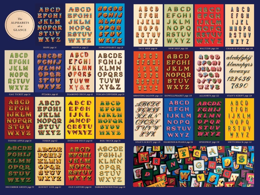
The title ‘All the Fonts of the Fair’ is a deliberate nod to the old British saying “all the fun of the fair,” a phrase with roots going back to 19th century fairground advertising to promote local and travelling fairs. Joby is the first to admit that the title of the book takes a few liberties with typographic accuracy, but the pun was too good to resist. Strictly speaking, the 26 alphabets in the book are not fonts at all. A font implies a complete, standardised typeface with lowercase letters, numbers and punctuation. Joby has created reference alphabets, most of which are capitals only, each one a unique original made with a brush instead of design software. Rather than a digitally created letter, these are created by a skilled signwriter. The result is lettering with all the charm and variation that comes from being painted by hand. No digital font will ever quite replicate that.
What makes this fancy lettering style so special?

Hope is not a quick letter style to paint. It is a rich, complex, three-dimensional style that draws on the flamboyant traditions of British fairground art, layering colour, gilding, decorative flourishes and shadow into something that feels both nostalgic and completely alive. Joby describes lettering like this as ‘fancy lettering’: it requires advanced signwriting techniques which should only be attempted once you fully understand the principles of traditional signwriting. When people think of traditional fairground lettering, this is a style that easily springs to mind. (Way better than ‘Rosewood’, the usual digital ‘go-to’ for ‘fairground style’ lettering which is a pet hate of Joby’s!)
The full Hope alphabet showcases everything that makes fairground lettering so distinctive: bold, chunky letterforms dressed in gradients of sky blue and rich red, framed with ochre gold, green flourishes edged in maroon, and a gilded block casting dramatic shadows beneath. Every letter feels like a work of art.
How is a Hope letter painted?

There are many stages in creating the lettering which is part of what makes the originals so remarkable. In All the Fonts of the Fair, Joby walks through the full method in detail with annotated notes to guide you.
The process begins with drawing out the basic letterform, then painting the face in two colours blended into darker shades. From there, decorative flourishes are drawn in and painted in ochre, the block is gilded and varnished, shading is added using burnt sienna oil paint mixed with varnish, and finally the shadow and cream outline are laid in to complete the letter. There are ten distinct stages before a letter is finished, and each one builds carefully on the last.
As Joby notes in the book, natural variation is part of the charm of painting by hand. The best approach is always to aim for correctness and let the variation come naturally rather than trying to exaggerate it.
If you want the full picture including all ten steps broken down with a detailed annotated diagram, All the Fonts of the Fair is essential reading.
The lettering legacy lives on

The Steam Yachts were one of the most iconic rides at Carters Steam Fair, and the lettering painted onto them made a deep impression on young Joby. Chris Hopes painted the boat ends and gag tickets on the Steam Yachts, and he was, as Joby has described, the first signwriter he can remember working at the fair. After Hopes, the ride’s lettering passed through other hands too. Stan Wilkinson added to it, and in time Joby himself worked on it alongside Aaron Stephens who worked as Joby’s first apprentice.
It is a reminder of how fairground art has always worked: a living, evolving tradition passed from one craftsperson to the next, each generation adding their mark to something that already existed.
While little exists online regarding the work of Chris Hopes, his influence lives on through Joby’s work and now through the letters, postcards and posters that carry his name.
The Hope collection
Original hand-painted letters

The original Hope letters were hand-painted by Joby as part of the All the Fonts of the Fair project. Each one is a unique, one-off artwork painted in enamel paint and gold leaf on aluminium composite board.
If you have been thinking about owning a piece of Joby’s work, these are as personal and significant as it gets. A handful of letters remain.
Hope postcards

For those who want to choose from the full A to Z, Joby is launching a new set of Hope alphabet postcards. Printed on glossy A6 card from high-resolution photographs taken during the making of the book, they are a beautiful and accessible way to own your initials or even the whole alphabet.
Whether you want to display them, use them as reference, or simply enjoy them as the beautiful designs they are, this is a fantastic way to bring a little fairground magic into everyday life.
Find out more about the Hope postcards
Hope reference poster

If you want to have a go at drawing or painting Hope yourself, the A3 Hope reference poster is a handy tool to keep on your desk or workshop wall. It shows the full alphabet clearly, giving you everything you need to study the letterforms and start practising.
Shop the Hope A3 reference poster
The Hope lettering represents what traditional signwriting is all about: passing skills and inspiration forward, one beautifully painted letter at a time.
You can read more about the handpainted alphabets created for All the Fonts of the Fair here.